Promotional, Responsive design, Html, CSS, Javascript, Monetate, Offshore teamwork
The Problem
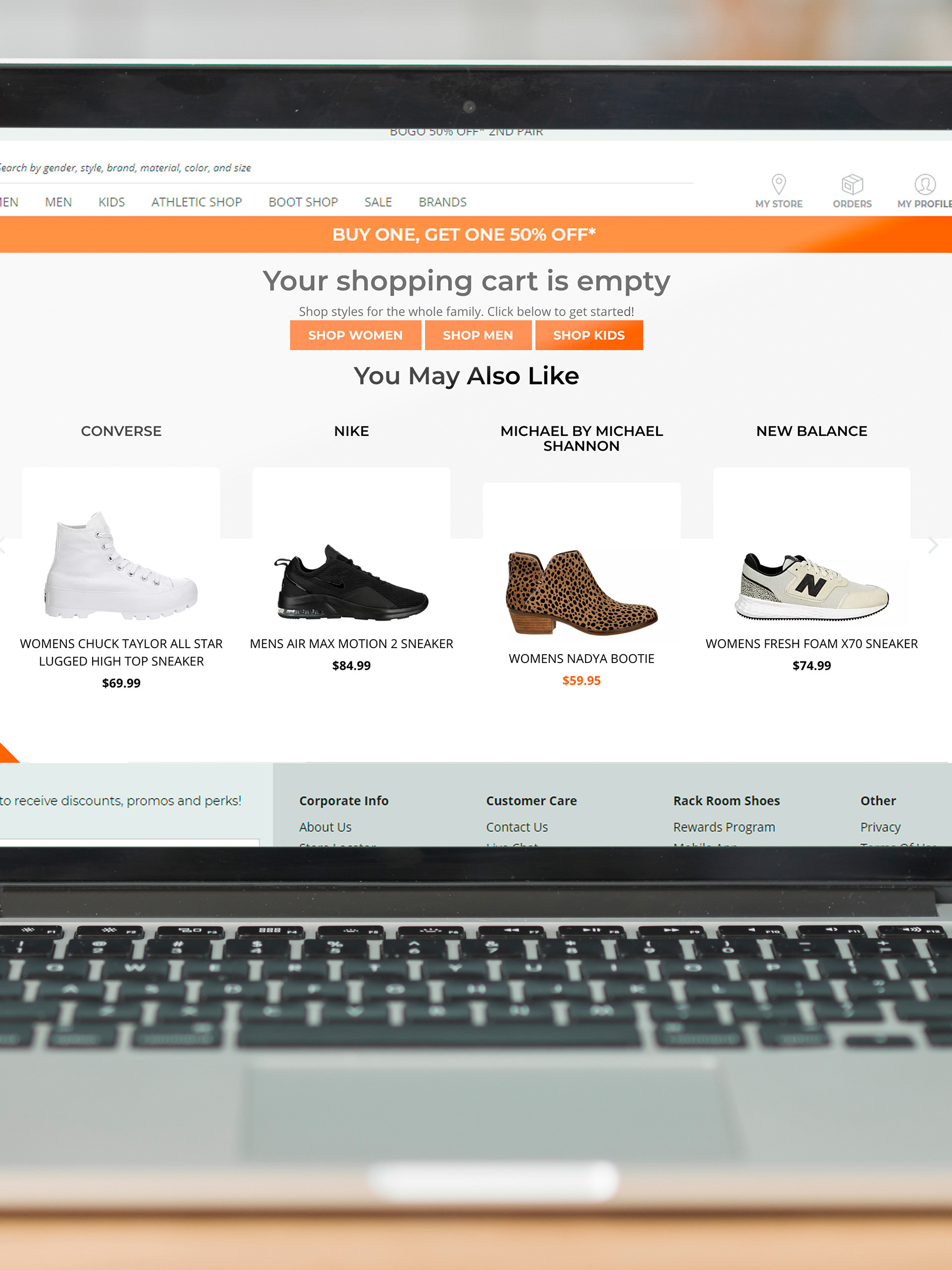
Lack of dedicated concise space for promotional messaging
Prior to the redesign of the website, there was no dedicated space for promotional banner messaging built into the site. The design of these banners also took up a lot of page real estate with multiline messages which pushed down content of the page and thus took focus away from the product.
Offshore team problems
An additional hiccup in the implementation of this design solution was that the particular individuals assigned to construct this on our offshore third party team were not able to get this coded right.


The Solution
Scrolling content, preserved space
To maintain a small amount of space used for the banners, I constructed a banner which took the traditional multiple line message into separate pieces, animated as a rotating message in the center (horizontally and vertically on desktop and mobile respectively). I had all of them displayed in a single line on desktop.
Additionally, the banner now hides as the user scrolls down the page, reappearing when they return to the top. freeing that area up completely.
If you want something done...
...sometimes you have to do it yourself.
I like to point this example out at times to illustrate that I am just as capable of implementing much of the design that I create. Indeed, I am often beginning from the point of html/css/javascript implementation and can sometimes skip image based examples and go straight into building a functional prototype. The offshore team was having problems getting it to work and after a month and ultimately being told this individual could not do it, I opened my browser console and got it to work in an hour or so in afternoon at a basic level before shooting it off to them to publish and complete.
The Results
Clean and concise
This process reduced the screen real estate taken up by promotional offering banners and internal messaging by up to 75 pixels or a reduction from 6 lines of text to 3, which was immense on mobile devices.
Internal processes for creation were greatly reduced in complexity with a uniform approach to banners that required essentially only the change of color for background and text to match creative supplied by marketing. The majority of all tweeks were to the actual content alone now. Which saved our department valuable development hours.